Grafana has a lot of fantastic visualizations built in. You can draw graphs of nearly every imaginable type, create beautiful maps, even build interactive flowcharts with multiple data elements that update in real time.
But my favorite (and definitely the most overlooked) panel is the simple text panel.
The text panel contains far more power than most people realize. The fact that it can act as a container for almost any HTML means that you can do a lot of really cool things with it.
Today let's look at how to use the text panel to draw horizontal and vertical separators on a dashboard.
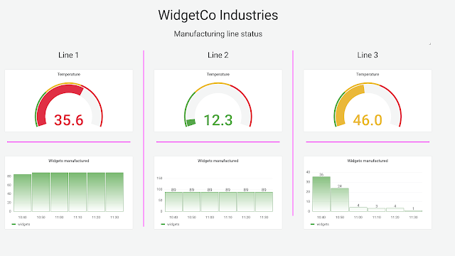
I've started by designing a simple dashboard showing some status information for three different manufacturing lines. In a plant like this, the plant manager wants to see the status of all the lines at a glance but still easily differentiate them for troubleshooting. With a small group of items, like the three here, it's useful to use a columnar layout. But Grafana uses a row orientation for dashboards, meaning it is easy to accidentally move a panel around slightly and have it be unclear which column it belonged to. And even if alignment isn't an issue, how can you let viewers know that you're lining up your data in columns rather than the default rows?
In the screenshot below, you'll see a possible solution: dividers between columns that make it perfectly clear that each graph "belongs" to a vertical group. (In this case I've used a very bright violet to make the dividers stand out, but in a real dashboard you'd probably want something a bit more subtle!)
While there's no "line" option in the text panel, you can use some simple HTML and CSS tricks to create one.
Vertical dividers
To make a vertical line, start by setting a few options on the text panel:
- No panel title (just delete the text that's there)
- Transparent background turned on
- Panel mode set to "HTML"
This will make your text panel as unobtrusive as possible. Getting rid of the title means that the full area of the panel will be available for your line with no space reserved for title text. Enabling a transparent background means that you won't have a bright border around the panel itself, and we'll need to write HTML for the trick to work.
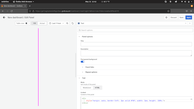
Once your panel is configured, add the following text:
<div
style="margin: auto; border-left: 3px solid #f0f; width: 3px; height: 100%">
</div>
Once you're done, your panel configuration should look something like this:
Let's break this down a bit.
The <div> HTML tag lets us create an empty HTML container. Usually this is used to hold text, images, or other content, but for our purposes we really just want a "thing" that sits on the page to draw a border around.
The style atrribute lets us attach CSS to this empty container. We set the margin to auto which means that our div will be centered within its parent container, in this case the Grafana panel.
We want either the left or right border on this empty container to be turned on; the div will only be as wide as the full border so it doesn't really matter which one, and "left" is just slightly shorter to type than "right" so being lazy, I used that. The properties of the border-left attribute control how the border will look. Changing "3px" to "5px" will make the border two pixels wider, and changing "#f0f" to "black" will change the color from violet to black. There are a number of ways to change this up, so check out the CSS border properties for more information.
Finally, we set the height of this container to 100%. This makes it adapt as the panel is resized. You can then easily make your divider longer or shorter just by resizing the Grafana panel.
Once this is done, you can shrink the panel down to the thinnest width and drag it out to be as tall as you need it to be.
Horizontal dividers
If you want a horizontal divider in Grafana, there are a couple of options available. You could use a similar technique as above but with a border-top instead of border-left. But HTML gives us a slightly easier way to make horizontal borders: the <hr> tag.
The <hr> tag creates a horizontal rule (i.e. line) in a page. And like most other HTML elements, it can be styled with CSS.
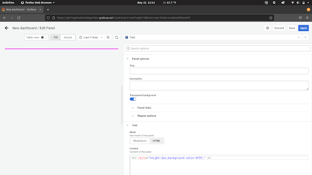
To create a styled horizontal divider in Grafana, start by setting up a transparent HTML text panel as described above. This time, add the following HTML:
<hr style="height: 3px; background-color: #f0f">
This will create a horizontal line on the panel with a height of 3 pixels and the same violet color we used before. Feel free to change these values to match your dashboard style.
Note that this won't center the line vertically in your panel, but that's usually okay -- you'll be resizing the panel to be as short as possible anyway. (If you really need some blank space above your line, remember that you can create a completely empty transparent text panel and resize it to whatever spacing you want. That's often easier than trying to center things vertically in CSS!)
I hope this helps you make beautiful and logical divisions in your dashboards. Go line everything up!


